


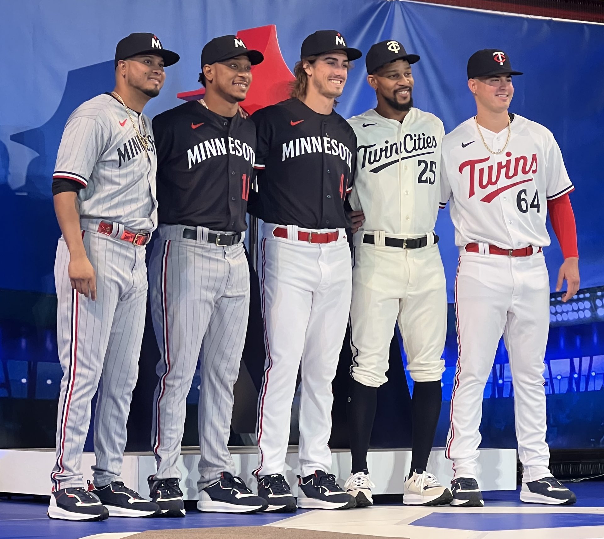
The Minnesota Twins today unveiled four new uniform designs along with a refreshed “TC” logo and an additional logo featuring an “M” with North Star shape meant to also convey a baseball diamond during an announcement event in the Rotunda of the Mall of America in Bloomington.
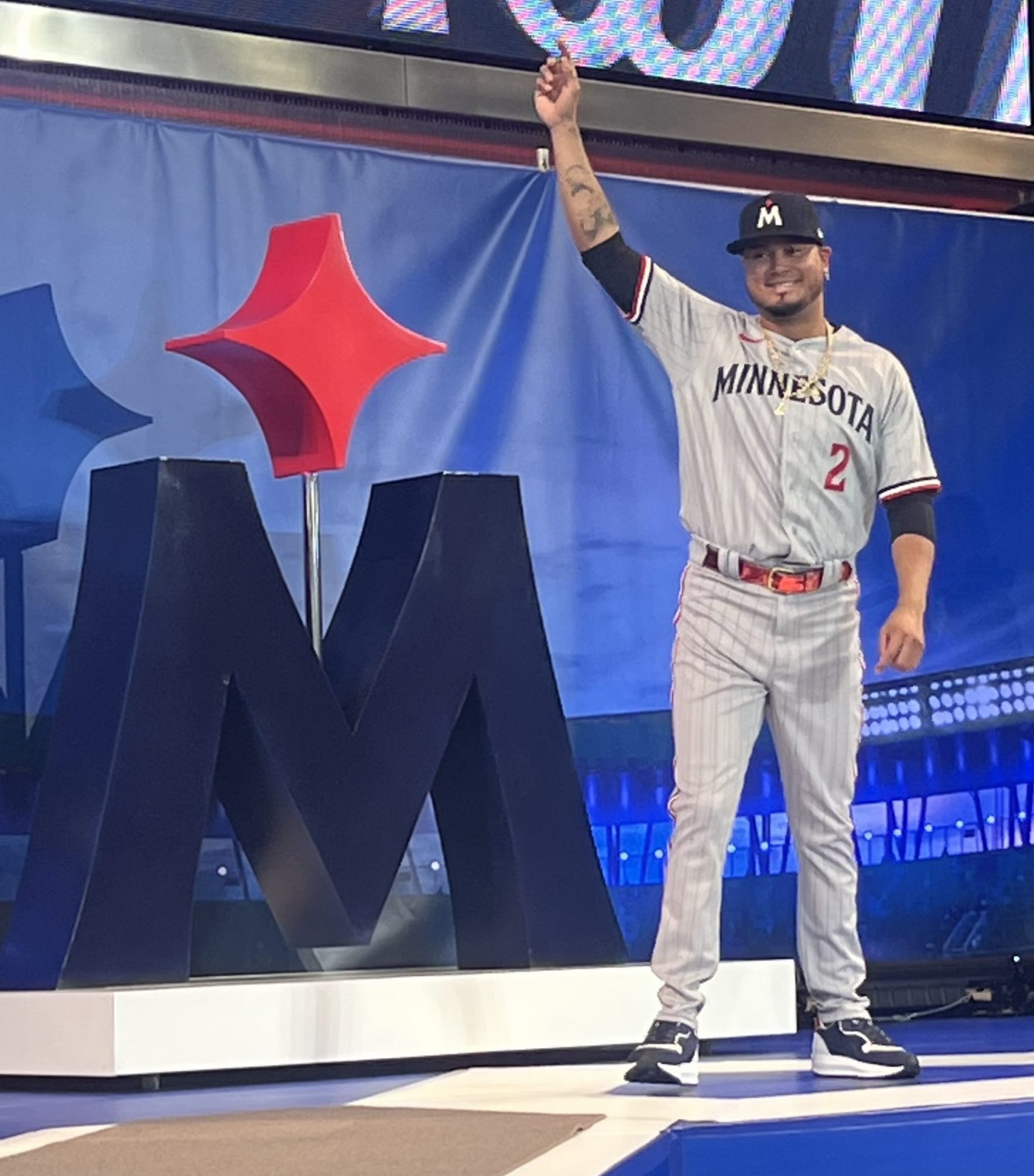
Current Twins players Luis Arraez, Byron Buxton, Jose Miranda, Jorge Polanco and Joe Ryan modeled the new uniforms by walking the stage as hundreds of fans and mall-goers watched overhead from all three balconies. The new uniforms included home and away designs, one with the words “Twin Cities.” Other Twins apparel from sweatshirts to jackets was also on display during the event. The new merchandise was available for purchase at a pop-up store and will be featured in the clubhouse store starting Saturday.
Jason DeRusha
Updates to the designs include a new font, a tweaked color palette with a brighter shade of red, darker navy blue, and updated white, and the elimination of secondary colors on the lettering.
“We are proud to be Minnesota’s baseball team, we are driven to create a bold new standard of excellence and we cannot wait to take the field in these fun, vibrant new uniforms that – like our organization itself – are inspired by the past and built for the future,” club Executive Vice President Joe Pohlad said in a news release.
According to the release, specific changes include:
- “TC” Hat: Staying true to the historical integrity of the hand-drawn mark interlocking “TC”” that debuted in 1961, but with subtle changes in weight and composition, this sleek and refined version cohesively fits in the club’s new design system to carry the “TC” forward for the next sixty years and beyond.
- “Twins” Script: Paying homage to the original 1961 “Twins” script, the distinctive “T” is separated from the connected, cursive “w-i-n-s,” while the “win” is underlined. The “Twins” script returns to red, as it was on the primary home uniform from 1972-2014.
- Piping: First seen on Rod Carew en route to his 1972 American League batting title and reintroduced on a throwback worn by Joe Mauer during his 2009 AL Most Valuable Player campaign, the sleeve and pant piping is a tri-color pattern of navy, white and red stripes.
- Sleeve Emblem: Linking to the fabled mark of Minnie & Paul standing within the state outline, the left sleeve features a navy Minnesota silhouette adorned with a red North Star, representing the location of Minneapolis and St. Paul.
- Player Name and Number: Numbers return to the front of the uniform, but, in a first for the home jersey, they are in navy to offset the “Twins” script, in a vivid juxtaposition of all three primary colors. The player’s name and number on the back (also delivered in the Twins’ exclusive new font) are presented in offsetting navy and red, respectively.

Jason DeRusha


